Performing advanced risk analysis with RiskTree®
How to use the advanced analysis features of Risktree to perform an efficient and detailed assessment of risk
Recent updates to RiskTree have added significant new features, including the ability to create bow-tie diagrams, and perform quantitative risk assessment. This is all very well, but how can you best use these tools to analyse risk?
Tl;dr
Perform your initial risk assessment by building attack trees. Determine what bad things will keep you awake at night, and model these using bow-tie diagrams. Take the scariest of these and use quantitative analysis to understand these risks in more detail.
Look at the big picture
To start with, use RiskTree to build the attack tree diagrams as you have previously. The software makes this a fast process, and you can model some large and complex scenarios. Build your trees for all of the attacker goals (aka bad outcomes) that seem feasible.
Once you’ve built your trees, including the assessment values and countermeasures, generate your risk assessment report using the RiskTree Processor. Again, this hasn’t changed from before. You can use the report to find the areas of greatest risk using the tables of data and the variety of data visualizations – whatever works best for you.
Dressing it up with a bow-tie
Now is the time to build your bow-tie diagrams. There’s no reason that you shouldn’t link every risk into a bow-tie, but you might find this to be a better use of time if you focus on the high risks. Think about the undesirable outcomes; for example, a Steal data tree might have a number of risks that could lead to the loss of personal data. You can create a ‘Loss of personal data’ outcome and link all of the appropriate risks to it, using the Bow-tie builder. This can be found in the Risk Manager, opened by clicking on the Manage risk icon in the Risk table.

Once you’ve created an undesirable outcome, add the consequences of this. A loss of personal data might have consequences of a fine from a regulator, a fall in sales, or a drop in share price. All of these can be added. Consequences can have up to three impacts linked to them. For this example, the impact of a regulatory fine might be financial and reputational.
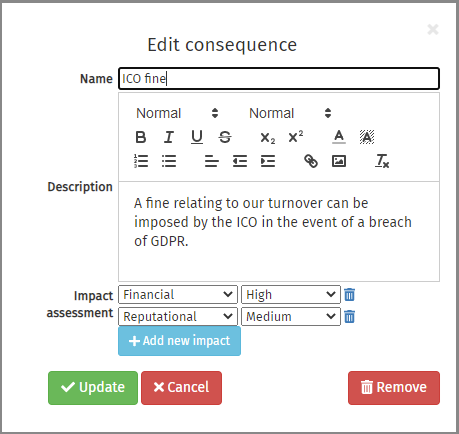
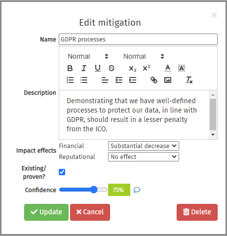
Next, mitigations for these can be suggested. The regulatory fine might be mitigated if you can show that you have followed appropriate data handling processes and procedures, so document this. Mitigations will affect the impacts from the consequence, similar to how countermeasures affect risks in RiskTree. You can also specify how confident you are in the strength of the mitigation.
Complete this process for each outcome that you want to consider. Once you’re done, go to the Bow-tie tab in the risk assessment report. Here you can view each bow-tie diagram in turn by selecting the outcome from the drop-down.
Bow-tie assessment
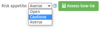
The next stage is to assess each bow-tie. This looks at all of the risks that can lead to the undesirable outcome and the countermeasures that mitigate them, and then the impacts and their mitigations. RiskTree finds the highest risk and worst consequence for each outcome and generates an outcome risk level based on this. Outcome risks will be provided at intrinsic, residual, and target levels, if your data covers these. You can set your risk appetite at this stage, as this is needed for the assessment. More information about risk appetite levels and how they affect the assessment is in the RiskTree help.
The road to Monte Carlo
As with bow-tie diagrams, you can perform quantitative risk assessment on every risk in your report. This will take a lot of effort to accurately provide the necessary data though, and so you will probably want to start with the worst bow-tie outcomes.
If the risk node doesn’t already hold quantitative data, this can be added from within the bow-tie diagram by clicking on the Edit quantitative data button in the pop-up for the node. Add the values, and return to the bow-tie tab. Repeat until all of the risks have their quantitative data and then click on the Quantification sub-tab in the Bow-tie tab. You will see the loss exceedance curves for the risks contained on the bow-tie diagram. Confirmation will be given via the list of risks in the table next to the chart, so you can see which risks have been included in the calculation.
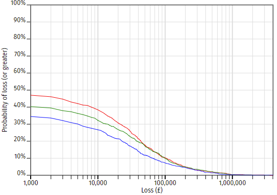
The chart is read by looking at the loss (along the x-axis) and reading up to the curve to determine the probability. In the chart above, the loss of £10,000 is 38% intrinsically, 33% residually, and 27% at target. This means that in the time period being considered (typically one year), and with the current set of controls — hence the residual risk — there is a 33% chance of a loss of at least £10,000 occurring. Reading across, there is a 10% chance of the loss being £100,000 or more, and a 2% chance of a minimum £700,000 loss.
You can then repeat this process for any other bow-tie diagrams that you would like to model. The loss exceedance curves for any individual risk can be seen on the Quantification tab in the Risk Manager. You can also see the combined curves for every risk in the report via the Risk Charts tab, and selecting Quantification. This chart also lets you control the fidelity of the curves, by setting the number of Monte Carlo simulations that are run.
Some technical detail
So, what’s going on to create these curves? Behind the scenes, RiskTree is running simulations, using a technique known as Monte Carlo analysis. For each risk, it looks at the probability that it occurs, and the 90% confidence interval (CI) for the losses when it does. Imagine a risk with a 10% probability, and a CI of £10k – £100k. RiskTree will run a number of simulations using these numbers. In 90% of the simulations, the loss will be £0. In 9% of them, it will be a randomly chosen value within the CI. In 0.5% of them, it will be less than £10k, and in the remaining 0.5% it will be above £100k. The choice of random numbers is made using what is known as a log-normal curve; this is a distribution curve that starts at the origin and tails off towards the right-hand side.
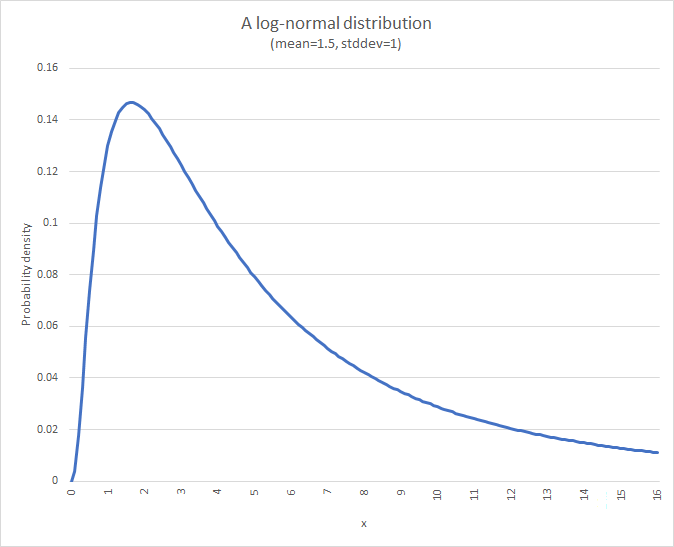
The CI of the curve is calculated to match the CI data. This shape of curve is used because losses cannot be less than 0, and so a standard symmetrical distribution curve will not work in this situation.
RiskTree runs between 100 and 10,000 simulations to create each chart – the number run determines the fidelity of the curve. Low fidelity charts have rougher lines, but are quick to calculate; the high-fidelity charts take longer but have smoother lines. Each simulation calculates this curve for each included risk, and will also adjust the scores in line with the calculated effectiveness of countermeasures so as to create the residual and target curves. If your countermeasure effectiveness is small, you might find that low-fidelity charts have points where the residual or target risk is above the intrinsic risk, but this is an artefact of Monte Carlo analysis.