Risk Charts
The distribution of your risks across the risk bands is shown by the risk charts. You can choose between seeing them on a pie chart and a pyramid chart. For both, you can select which type of risk assessment to view: intrinsic, residual, or target. At the bottom of the risk chart screen, there is a text editor that allows you to enter your own commentary on the charts. This will be saved into the report file, and included in the report printout, and allows you to document key features of your charts.
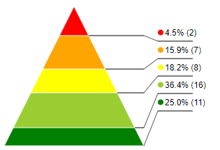
Pyramid chart

The pyramid chart shows the relative proportion of risks in a stacked format, with the highest risks at the apex of the pyramid. The area of each segment is proportional to the number of risks; the shape of the chart therefore emphasizes the higher risks because the segments representing higher risks are taller (but narrower).
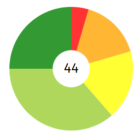
Pie chart

The pie chart shows the relative proportion of the risks in a conventional circular format, with the angle of the segment proportional to the number of risks at that level. The centre of the chart shows the total number of risks. Moving your mouse cursor over a segment of the pie chart shows the number of risks that are represented by that segment.