Risk quantification
RiskTree can perform Monte Carlo analysis of risks where additional information can be provided, leading to a more detailed analysis of risk.
Enabling the risk quantification function
The information required for the risk quantification function needs to be added in RiskTree Designer; please read the help page for more information on this.
Creating risk quantification graphs
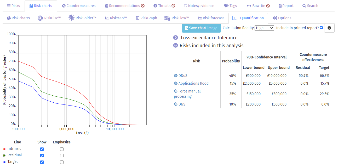
The main risk quantification graph is found on the Quantification tab on the Risk charts tab. The chart can take a few minutes to calculate. The risks that have been used in the calculation are shown in the table to the right.

The chart has a logarithmic x-axis, showing the loss. The intrinsic, residual, and target values are shown in red, green, and blue curves respectively. Any point on curve shows the minimum probability (y-axis) of the loss (x-axis). For example, in the chart shown above, for a loss of £1 million, the intrinsic probability is 43%, the residual is 29%, and the target is 23%.
The data about the risks used to create the graph is shown in the right-hand table. Clicking on the crosshair symbol will show you the risk on the RiskTree tab, and clicking on the risk name will highlight that risk in the risk table.
Loss exceedance tolerance
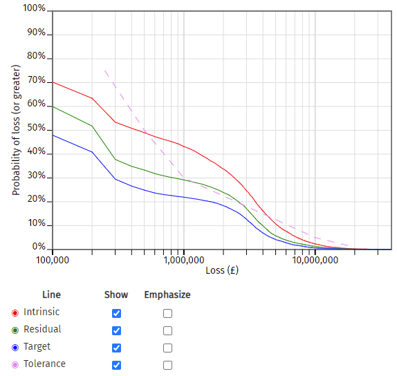
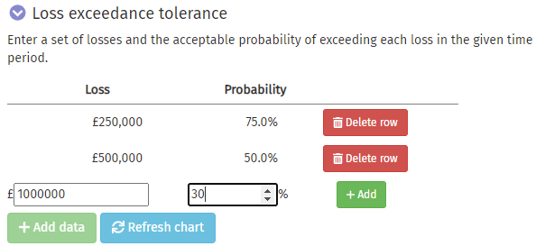
You can add a loss exceedance tolerance curve to your graph. Open the section above the risk table by clicking on Loss exceedance tolerance. Enter values by clicking on the green button, and typing in a pair of values representing a loss, and the percentage chance that the risk would be acceptable. Click on the green button to confirm the data. Repeat until you have entered all of your values, and then click the blue button to create a new chart including your loss exceedance tolerance curve. If you make a mistake entering data, click on the red green button.
| The loss exceedance tolerance curve section | A graph with a loss exceedance tolerance curve |

|

|
| Entering loss exceedance tolerance data | |

|
The loss exceedance tolerance curve is shown by a dashed magenta line.
Other functions
You can customize the graph by using the checkboxes in the key below. Any of the lines can be removed by unticking the checkbox in the Show column. Also, any line can be emphasized through greater thickness by ticking the checkbox in the Emphasize column.
A copy of the graph can be saved in PNG format by clicking on the blue button.
The fidelity of the curves can be adjusted by changing the number of iterations made by the Monte Carlo analysis. Greater fidelity produces smoother curves, but will take longer to calculate. The Calculation fidelity drop-down allows this to be changed. This can speed up checking a loss exceedance tolerance curve, by making the initial fidelity low as the data are entered, and then finally running a high fidelity calculation when the curve data have all been added.
Other quantification charts
Risks with quantification data can have a chart produced for only their data. These charts can be found by opening the Risk Manager on the Risk table tab and selecting the Quantification tab.