RiskFlow™
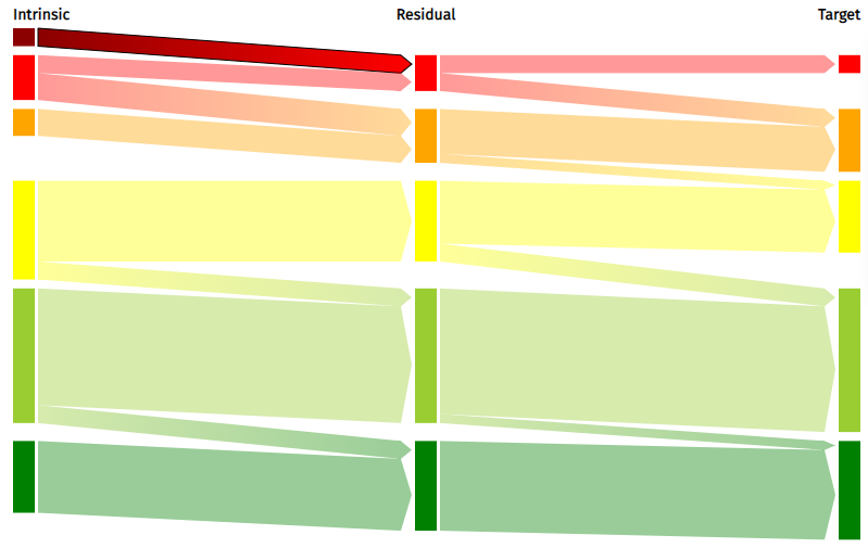
RiskFlow is a Sankey-style diagram of the risks provided in the files uploaded to the Risk Processor. It looks at the number of intrinsic, residual, and target risks in each riskband, and how each risk changes (or not) between riskbands. The three types of risk are shown as columns, with the highest risks at the top. The height of each riskband is proportional to the number of risks. The flow of risks is shown by the lighter coloured flows between the columns, which again have their height proportional to the number of risks that they represent. The riskbands and colours used in the RiskDisc will match those of any uploaded configuration file, with the flows between different risk bands changing colour along their length.

In the diagram above, there are two Very High intrinsic risks, both of which are mitigated to become High residual risks. Beneath this flow is the flow representing another two risks which remain High at both intrinsic and residual. The remainder of the High intrinsic risks are mitigated to High at residual. All of the intrinsic risks at Medium remain in this riskband in the residual column.

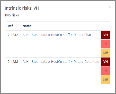
Moving your mouse over the blocks forming the columns will show information about the risks of that type and riskband, including the node number and name, the calculated risk level(s), and the node from which the risk level is inherited if the cursor is not on a risk (end node). In the example shown above, the Very High intrinsic risk block has been selected. The pop-up box shown here gives the type of risk (intrinsic), the riskband, the number of risks, and a table containing details of the risks. In the table, each risk has the intrinsic, residual, and target risk levels shown stacked on the right. The type of risk being viewed is shown in bright colours; the others are faded out (i.e., the residual and target risks above). The risk names are hyperlinked to the detailed risk information contained in the risk table.

If the mouse cursor is moved over a flow, the pop-up box shows information about the risks in that flow. This provides the node reference and risk name in a table; again, the risk name is hyperlinked back to the main risk table. When this pop-up is shown, the relevant flow is highlighted in brighter colours and is given a black outline. The example above shows the flow of risks from High residual risks to Medium target risks.
Clicking on a risk block or flow will 'lock' the pop-up box in place; in other words, it will no longer change as the mouse cursor is moved over the diagram. This can be helpful if you want to explore an item that is completely surrounded by other blocks or flows. The pop-up box can be closed by clicking on the × symbol in the top-right corner of the pop-up. This will restore the action of highlighting information as the mouse cursor is moved over the diagram.
By default the flows have arrow heads on their right-hand edges, indicating the flow direction. These can be removed by unticking the Show arrow heads on flows checkbox.
At the bottom of the RiskFlow tab, there is a text editor that allows you to enter your own commentary on the RiskFlow diagram. This will be saved into the report file, and included in the report printout, and allows you to document key features of your diagram.
If you want an image file of the RiskFlow diagram, perhaps to use in a report or presentation, click on the button. This will open the Save chart image box.