RiskMap™
Basic functions
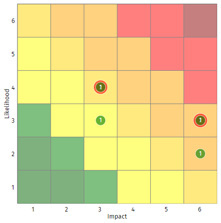
RiskMap calculates a more traditional impact and likelihood score for each of your risks, and for each of the risk assessment types (intrinsic, residual, and target). It then creates a bubble chart with impact and likelihood on the two axes, and with a set of circles whose area is proportional to the number of risks with the given impact and likelihood. The three assessment types are shown in different colours, and they can be switched on and off using the checkboxes to the right of the RiskMap. The number of risks represented by the circle is shown at its centre.

The RiskMap shown above has four risks. At the intrinsic level (red circles), two of them have an impact of 6 and a likelihood of 3; the other two have an impact of 3 and a likelihood of 4. At the residual level (green circles), one risk from each of these pairs has its likelihood reduced by 1 due to the application of countermeasures. These are shown by the green circles on their own, with the two unchanged risks being shown by the green circles that sit over the (larger) red circles.
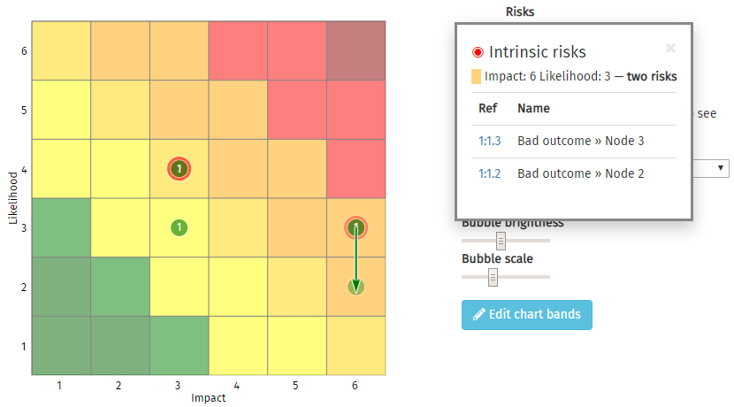
If you point your mouse cursor at a circle, a pop-up box will list all of the risks that the circle represents. Clicking on the risk reference will switch you to the Risk Table, with the relevant risk highlighted. If a risk has moved between levels, moving your mouse cursor over its name will show one or more arrows on the RiskMap that indicate how the risk has changed. The example below shows that the likelihood of the 'Node 3' risk has dropped from 3 to 2. A green arrow indicates the change of risk from intrinsic to residual, and blue arrows show the residual to target changes.

More detailed features
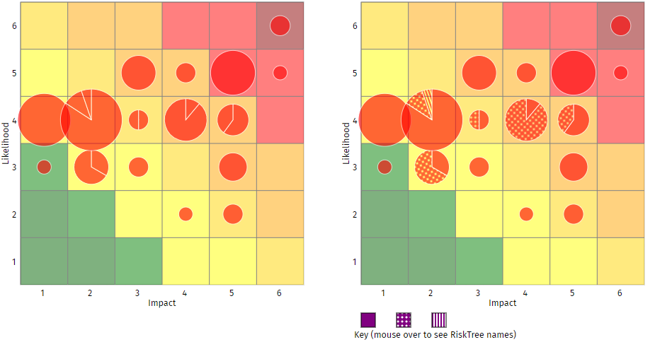
If you load multiple RiskTrees to create a report, many of the bubbles on the RiskMap will contain risks from different trees. By default the bubbles aggregate these together, and the only way to see which trees the risks are from is by examining the list of risks in the pop-up. The distribution can be shown on the RiskMap though, by changing the Show bubbles as selector. This way they can be shown as pie charts, either in solid colour or with a patterned fill. Both types are shown below.

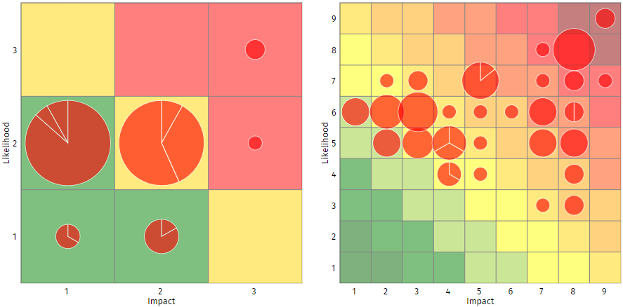
The size of the RiskMap can be changed using the RiskMap size selector. You can choose from a 3×3 up to a 9×9 matrix onto which your risks are plotted. The RiskMap will be dynamically changed when you change this setting, and your choice will be saved into the report so that it remains the default setting.

Other sliders let you adjust the brightness of the background and bubble colours. The scale of the bubbles can be changed as well, which can be useful if you have a lot of bubbles that overlap, or small widely-spaced bubbles.
The background colours on the RiskMap are set automatically and run in parallel diagonal lines from top left to bottom right. It is possible to edit the colours of each line using the chart band editor.
At the bottom of the RiskMap tab, there is a text editor that allows you to enter your own commentary on the RiskMap. This will be saved into the report file, and included in the report printout, and allows you to document key features of your RiskMap.
If you want an image file of the RiskMap, perhaps to use in a report or presentation, click on the button. This will open the Save chart image box.