RiskMap™ chart band editor
The RiskMap allows you to create an impact vs. likelihood bubble chart for your risks. It has a standard set of background colours, ranging from green in the bottom left corner (low impact and likelihood) up to red in the top right. Depending on the size of the matrix used, there will be a different number of coloured bands. The bands all form diagonal lines from top left to bottom right on each size of matrix.
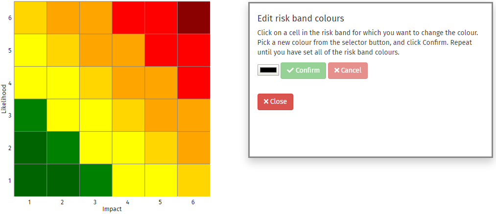
The colours used for the bands can be customized to suit your needs. Firstly, click on the button. This will open the editor box, and will also temporarily remove all of the bubbles from the RiskMap. The colours of the risk bands will increase to full brightness. The colour selection control, Confirm, and Cancel buttons will all be disabled in the editor.

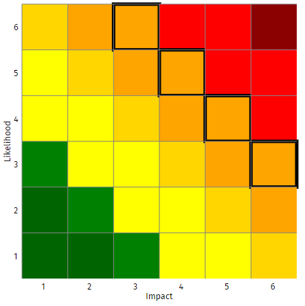
Next, click on a cell in the risk band that you wish to recolour. All of the cells in that risk band will be emphasized with a thick black border:

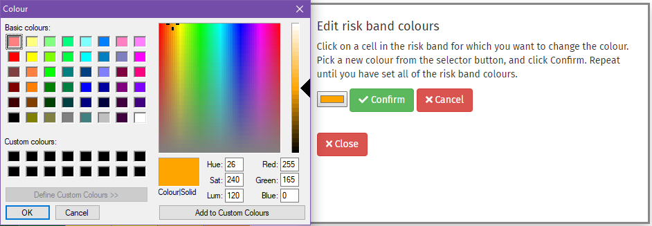
The colour selector will now change to be the same colour as the selected risk band, and the Confirm and Cancel buttons will be enabled. Click on the colour selector to set the new colour.

The colour selector control is generated by your browser, and might look different to that shown above.
Once you have selected a colour, click the OK button in the colour selector control. To make the change, click on the button; alternatively, click the button to revert to the original colour. The selected cells in the risk band will now change to your new colour, and the black borders will be removed.
Continue to make changes to the colours of your RiskMap risk bands until you are satisfied. Then click on the button to close the editor and return to your RiskMap. Your changes will be included in the RiskTree report file when you subsequently save.
You can change the risk band colours in RiskMaps of different sizes, and all of the changes will be retained and saved into your RiskMap report files.