The Risks tab
The first tab beneath the RiskTree shows details of all of the risks, as represented by the end nodes on the RiskTree. It will only contain data after you have calculated the risks, or if you have loaded a RiskTree file that contains calculated risk information. Until risks have been calculated, the tab will have a symbol, and the tab will note that the risks have not yet been calculated:

There are three sub-tabs: a risk summary, the risk table, and a mapping to your countermeasures.
The risk summary tab
The risk summary provides a breakdown of your assessed risks by risk type (intrinsic / residual / target), depending on the type of risk calculation that you have performed. To its right, a cluster bar chart shows the same information graphically.

The table and bar chart automatically show the risks from highest to lowest, left to right. To reverse this order, press the blue button beneath the table.
The risk table tab
Once the risks have been calculated, the risk table will appear in the tab.

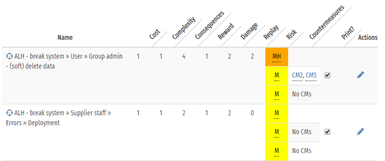
Each risk has a separate row in the table, and they are sorted from highest to lowest level of risk for the type of assessment chosen (intrinsic, residual, or target). If only intrinsic risks have been calculated then there will be a single row for each risk. If residual and/or target risks have also been calculated then additional 'sub-rows' will be shown in the Risk and Countermeasure columns. The following columns will be in the table:
- Name : gives the name of the risk (together with the names of its parent nodes, forming the risk path). Moving your mouse cursor over the
icon will highlight the node on the RiskTree diagram; clicking on the icon will centre the tree on that node. If a note has been added to a risk, this will be shown
in blue italic text beneath the name, with a bullet point matching the note colour (if selected). Any tags will be shown below the note in bright blue. This is shown in the example below.

- Cost, Complexity, Consequences, Reward, Damage, Replay : lists the assessment values for this risk, as used for the type of assessment. The original values, if different, are shown beneath in parentheses. If the risk is a Hazard then its likelihood value will span the first four assessment value columns.
- Score (change) : this column shows the calculated numeric score for the risk. The sub-rows for residual and target risks will include the change from the row above in parentheses, together with an arrow showing the direction of change. In the example above, the intrinsic risk score is 42 (Medium), the residual score is 28 (Low), and the target score is unchanged from residual.
- Risk : shows the name and colour of the risk level into which this risk has been placed.
- Countermeasures : lists the countermeasures that have been used in the calculation of this risk. This will always be blank in the intrinsic sub-row. In the example above, the residual risk has
been reduced because of countermeasure CM8. Moving your mouse cursor over the reference number will show the countermeasure name, and highlight the countermeasure on the RiskTree.Clicking on the
countermeasure reference will switch the view to the Countermeasure tab with the relevant countermeasure highlighted briefly with a yellow background.
If no countermeasures are applicable, No CMs is shown in this column (as seen above for the target risk level). If a residual countermeasure has a
confidence level of less than 100%, by default this will be set to 100% for the target calculation (on the grounds that you should be aiming to have
100% confidence in your countermeasures). This means that the target risk can be lower than the residual risk, even though no target countermeasures apply. In this instance, a blue
symbol is shown beside No CMs as a reminder.

- Print? : the checkboxes in this column are ticked by default. Unticking them will remove this risk from the page when it is printed.
- Actions : shows icons for actions that can be performed on this risk, and also highlights features of the risk. Clicking on the icons allows the feature to be edited:
- - allows the risk to be edited
- - allows the notes for the risk to be edited directly
- - allows the tags on the risk to be edited directly
The Risk to Countermeasure mapping tab

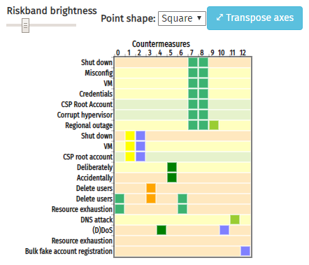
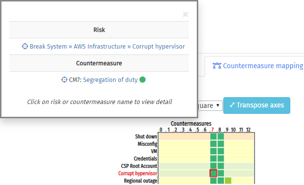
This tab contains a matrix which shows which countermeasures affect each risk. By default, the risks will be listed down the left-hand edge (the y-axis), and the countermeasures on the top edge (the x-axis). Risks will just show the final node name, and countermeasures their reference number. Clicking on a node name or countermeasure reference will open a pop-up box giving the full name of the item, and crosshairs to highlight it on the tree. The risk name or countermeasure reference will be highlighted in red on the matrix.
If risks have been calculated, each risk row will be coloured to match the calculated risk level (otherwise they will be white). The colours will initially be for the intrinsic risk levels. This can be changed by altering the drop-down that applies the risk colours to the RiskTree. The brightness of the rows can be altered using the slider to the top left.

If a risk is affected by a countermeasure, a coloured square will appear at the intersection of the relevant row and column. This will be coloured to match the countermeasure (including confidence levels. Clicking on the square will open a pop-up box giving details of both the risk and countermeasure, with crosshairs to locate the item on the RiskTree. You can click on the risk and countermeasure names to jump to the more detailed information on the risk and countermeasure tabs, and the countermeasure will also show a coloured circle matching its colour on the RiskTree; moving the mouse cursor over this will indicate the reason for the colour (e.g., its confidence level).
The matrix allows you to quickly spot where a risk has a lot of countermeasures, or which risks have few or none. Conversely, you can see where a countermeasure is used by a lot of risks, which might indicate that it is particularly important to your risk management.

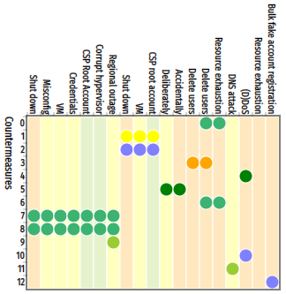
If you have a lot of risks but few countermeasures, it might be more convenient to transpose the axes so that it makes better use of the width of the screen. This is performed by clicking on the button. Clicking again will switch back to the original layout. The coloured squares in the matrix can be converted into circles by changing the Point shape drop-down, as shown in the example above.